This post may contain affiliate links. Please read our disclosure policy.
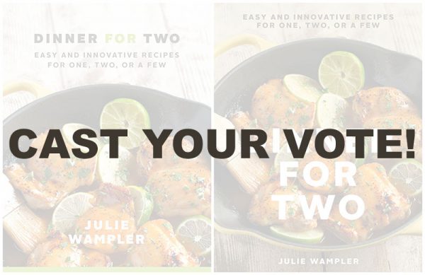
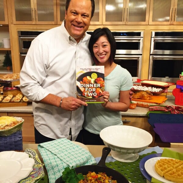
YOU GUYS. Guess what?! I FINALLY got my cookbook cover options to share with you!! I’m so so excited. It’s all starting to come together :)
I’d LOVE for you guys to vote on which one you guys like the best – there is a form at the bottom of the page where all you have to do is pick 1 or 2 and submit it! Easy peasy. There is also space for you to tell me why you chose the one that you did but that’s totally optional. Would love to get your input by Wednesday afternoon so I can get back to my editor! Thank you, thank you!
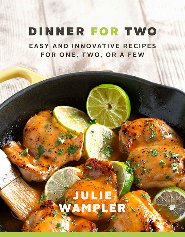
Cover Option #1:
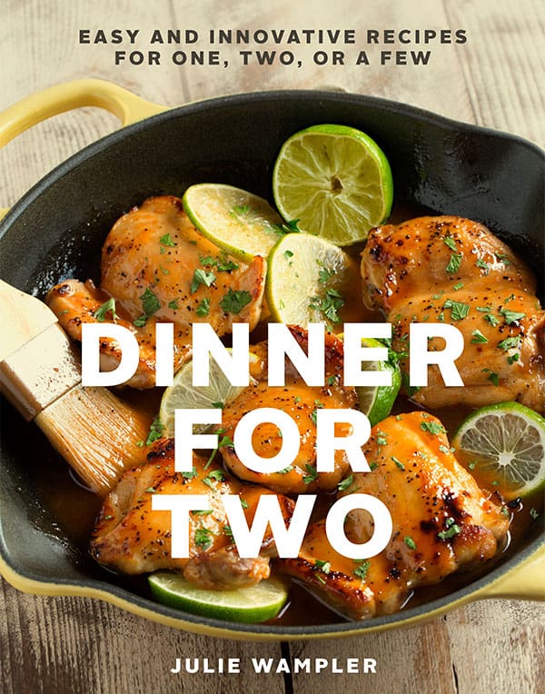
Cover Option #2:


So pretty, congrats! If I had to choose I would pick #1 but both are great! :)
Hard decision but #1 is looking really good! Congratulations!!
So excited for Julie! They both look great, I chose 1. The text on Option2 is too bold and detracts from the food. Maybe if the opacity was lowered and it wouldn’t stand out so much to me.
Definitely the first 1! I like the close up & the title is hard to see on the 2nd.
I love them both!
I love the first one!
A giant congrats to you, lady. Much deserved.
So exciting, Julie! Thank you for involving us by asking our input. Definitely #1! It is brighter, more colorful and the overall composition is inviting. In bookstores, you want folks to be drawn to your book and to pick it up. #1 is the hands down winner! xo
Love the second one!!
Love #2. Congratulations, how fun!